Popular Speakers

Ron Clark
"America's Educator", NYTimes Best Selling Author, Disney's American Teacher of the Year, and Founder of the Ron Clark Academy
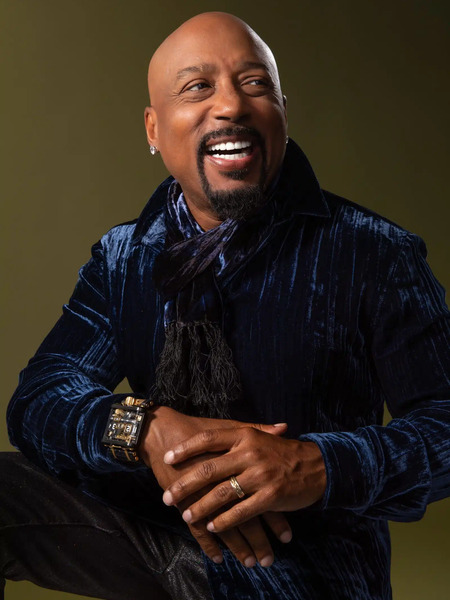
Daymond John
Founder/CEO of FUBU, Presidential Ambassador for Global Entrepreneurship, Star of ABC's Shark Tank and CEO of The Shark Group

Dr. Ben Carson
Former US Secretary of Housing and Urban Development / Conservative Political Thought Leader / Renowned Pediatric Neurosurgeon

Earvin “Magic” Johnson
Five-Time NBA Champion, Entrepreneur

Dr. Jessica Kriegel
CEO Advisor and Doctor of Leadership

Deion Sanders
Pro Football Hall of Famer, Two-Time Super Bowl Champion and Coach

Ryan Leak
Inspiring Workplace Cultures Rooted in Values, Passion and Risk-Taking

Valorie Burton
Best-Selling Author, President and CEO of The Coaching and Positive Psychology (CaPP) Institute, Personal and Executive Coach and International Speaker