soft cartoonish whoosh as a dog spins around, ending in a cheerful boing and subtle win chime. bouncy, slightly comedic tone, clean arcade style, no harsh metallic sounds, smooth and polished transition.
0:01
soft cartoonish whoosh as a dog spins around, ending in a cheerful boing and subtle win chime. bouncy, slightly comedic tone, clean arcade style, no harsh metallic sounds, smooth and polished transition.
0:10
Generate a deep, heavy scatter drop with strong sub-bass impact. Start with a short descending whoosh, then a solid brick-like thud with a subtle metallic shimmer. Add a faint tonal accent to hint importance. Tight, punchy, minimal reverb, slightly more presence than regular symbols.
0:01
A premium, cinematic sound logo. It begins with a deep, authoritative sub-bass pulse (representing leadership depth). The tone is sophisticated, calm, and expensive. It should transition from a dark, heavy atmosphere to a bright, airy, and 'whole' resolution. No harsh edges, only smooth, high-fidelity transitions.
0:10
dark drill impact one shot, deep cinematic hit with heavy low end punch, gritty noise layer and dark air burst, powerful drop effect used before beat drops, no metallic ringing, no synth tone, controlled short decay, underground drill energy, total length around 1.2 seconds
0:02

Dark cinematic esports logo reveal. Deep sub rumble and rising tension. Fast whoosh into a heavy metallic slam impact. Neon electric crackle and bright metallic shimmer after the hit. Short controlled reverb tail. End with a brief clean silence for a voice tag. No music, no vocals.
0:10
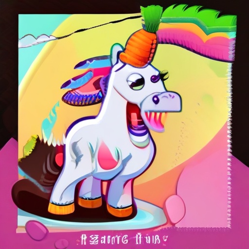
Cartoon Crunch": A loud, crisp, exaggerated crunch (like a horse eating a carrot).
"Whoosh Transition": A fast wind sound as the camera zooms into the mouth.
"Boing" or "Spring": Use this when the Apple Diver character lands on the tongue to show he is bouncy and friendly.
0:10